Rainbow Doobies: Colour as Architecture
Colour, at a certain scale, stops being decorative and starts being structural. It changes how a building sits on its block, how light interacts with a facade, how pedestrians orient themselves on a street. Rainbow Doobies was designed with this understanding: that a mural operating at full architectural scale is not ornamentation applied to a building but a fundamental reconfiguration of how that building participates in the urban fabric.
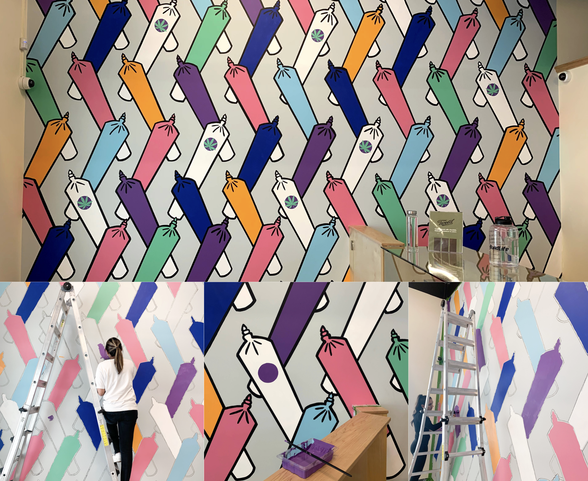
KINN Studios was commissioned to create a vibrant, large-scale mural for a commercial retail location in Calgary. The directive was clear: the work needed to be bold, unapologetic, and impossible to walk past without looking. But boldness without discipline is noise. The challenge was to deploy maximum chromatic energy while maintaining the compositional rigour that separates a mural from a painted billboard.
Colour at scale is not decoration. It is a spatial event.
The Palette
The colour strategy for Rainbow Doobies was built on saturation and rhythm. Rather than a random explosion of hues, the palette was orchestrated with the same intentionality a composer brings to a score. Warm and cool tones alternate in a cadence that creates visual movement across the surface, pulling the eye along the wall in a deliberate sequence. The result is a mural that feels energetic without feeling chaotic, vibrant without feeling unresolved.
Every colour decision was tested against the specific light conditions of the site, the materials of the surrounding streetscape, and the viewing distances at which the work would be experienced. A colour that reads as electric pink at two metres becomes a warm accent at fifty. The mural was designed to operate across all of these registers, rewarding both the close reading and the distant glance.
Presence on the Street
The finished installation gives the retail location an identity that is irreducible and unmistakable. It is not a brand asset that could be swapped for another. It is a one-of-one artwork, painted by hand at architectural scale, that belongs to this specific wall on this specific street. That permanence and specificity is what gives mural art its power in a commercial context. It signals investment, confidence, and a willingness to contribute something of genuine visual value to the public realm.
Rainbow Doobies stands as evidence that commercial art and cultural contribution are not opposed forces. The most effective commercial murals are the ones that give generously to the streetscape, that make the neighbourhood more interesting, more colourful, and more worth walking through. That generosity comes back to the business in ways that no paid advertising campaign could replicate.