Pekko: Pop Art at the Speed of a Fast-Casual Brand
Most restaurants hang art on their walls. Pekko became its walls. When the Calgary-based fast-casual concept approached KINN Studios, the brief was less about decoration and more about identity. They needed a visual language that could hold its own against the noise of a busy commercial strip, communicate the energy of their food without a single word of menu copy, and turn a standard storefront into something people would photograph, share, and remember. The answer was a floor-to-ceiling pop-art mural system that wraps from the interior dining room through the windows and onto the exterior facade.
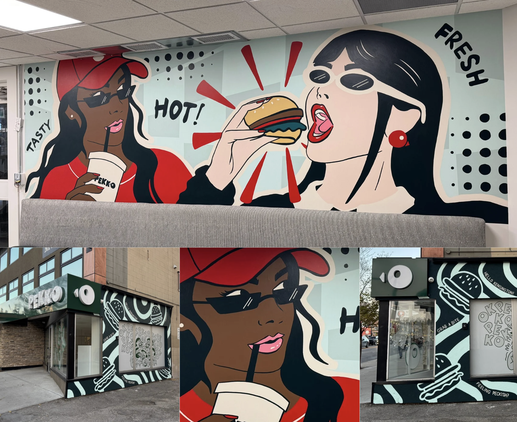
The interior wall presents two larger-than-life figures in full comic-book glory. A woman in a red cap and sunglasses sips a branded Pekko cup, her attitude so precisely rendered that you can almost hear the straw. Beside her, a second figure takes an enormous bite of a burger, red action lines radiating outward like a flavour explosion caught mid-frame. The words TASTY, HOT!, and FRESH punctuate the composition in bold display type, operating the way sound effects work in a graphic novel: not as labels, but as sensory cues that heighten the visual experience.
The Visual System
KINN Studios developed this mural as a complete visual identity system, not a standalone artwork. The graphic language extends from the interior wall to the exterior storefront, where a dark green and black-and-white scheme transforms the building facade into what reads, from across the street, as a giant billboard rendered by hand. The Pekko wordmark is integrated directly into the mural composition, wrapped by illustrated hands, burgers, and typographic elements that make the brand feel inseparable from the art. Halftone dot patterns, a direct reference to the printing techniques of vintage comic books, provide texture and depth across every surface.
When the mural is the brand, the brand becomes an experience you walk inside.
The colour strategy is precise in its restraint. A limited palette of reds, blacks, muted teals, and warm skin tones keeps the composition legible at every scale, from the close quarters of the dining room to the passing glance of a driver on the street. The red is the workhorse: it carries the energy, the appetite appeal, the urgency that fast-casual dining depends on. Against it, the cool teal background and black graphic elements provide the contrast needed to keep the eye moving without fatiguing it.
Interior Meets Exterior
The most sophisticated aspect of the Pekko project is its continuity. From inside the restaurant, the mural reads as an immersive dining environment, a space where the walls participate in the meal. From outside, the same visual language transforms the building into a landmark, something that announces itself to the streetscape with the confidence of a gallery installation but the accessibility of a neighbourhood joint. The transition between interior and exterior is seamless, the graphic language adapting to each context without losing its identity.
This is commercial art in the most honest sense of the phrase. It serves a business objective. It drives foot traffic. It creates social media content organically. And it does all of this while functioning as a genuinely compelling piece of visual art, one that rewards the sustained attention of someone sitting with their meal as much as the split-second glance of someone walking past. That dual legibility, the ability to work at the speed of a scroll and the pace of a lunch hour, is what separates mural-as-branding from mural-as-wallpaper.